


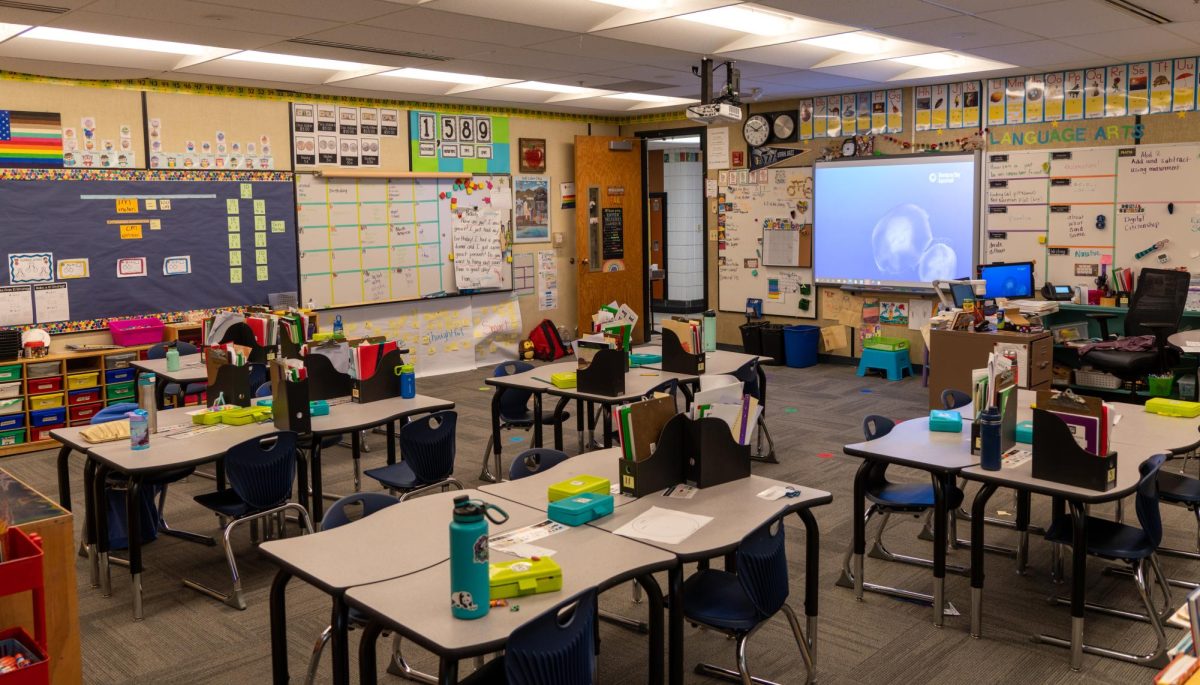


Similar to boiling water that is so hot it actually feels cold, the University of Utah’s CIS portal redesign oversimplified the layout beyond the comprehensible limit. Instead of orderly links that could easily be minimized, students are presented with “intuitive” images. Administrative officials overseeing the project insist that rigorous Google analytics tracking was conducted prior to the changes. In reality, it seems like the University hired an unemployed cartoonist to illustrate every conceivable link with a corresponding, ambiguous image.
Do we really need a tab to see our demographic data?
For those who are fortunate enough to actually work for the University, CIS is even worse than the base model. There are now eight distinct pages with little crossover, meaning that employees are forced to wade through the cartoonist’s gallery until the right image seems familiar. Although the scrolling latency will likely be addressed in a future update, at the present moment, watching the shadow move on a sun dial would be faster and more entertaining.
The changes were inspired by the University’s push to modernize all online and marketing content. “Campus Information Services (CIS) hasn’t been redesigned since 2003, and thus hasn’t aligned with today’s design standards for many years. It can be difficult to use, is non-responsive for mobile devices, and is visually cluttered…” read the University’s statement regarding the update. Understandably, our school is in the PAC-12 now, which means that there is more funding for high priority initiatives (i.e. football subsidies). Alongside that notable distinction is the necessity for contemporary designs.
Considering that CIS was just updated, it would be unfair to say that the University will never address the considerable mistakes made during the update. Perhaps, if students are allowed to upload their own emoticons to represent the tabs, the system would be even more streamlined. Either way, there are various components that should be addressed immediately, beginning first with clusters of ambiguous forms raising their hands. Amongst those who value cleanliness or organization, the new CIS is a hellish reality—especially when presented with eight pages of tiles that take several minutes to respond.
Technology companies face a remarkably similar issue when designing user interface (UI), as striking a balance between modernization and false simplicity is difficult to achieve. The development team in charge of the project did seek guidance from the “…Academic Senate, and campus IT governance committees in the months leading up to the release.” However, it is rather apparent that an echo chamber of enthusiasm ultimately led to the current state of affairs. Removing some of the tiles using the customization feature does help alleviate the issues with latency, but this naturally begs the question: why redesign CIS before consolidating the links?
The University of Utah seemingly believes that us tech-savvy Millennials will eventually figure out the convoluted system. Until that point, I look forward to clicking the “help” tile, and viewing my demographic data as well. For questions regarding the CIS redesign, contact the UIT Help Desk at 801-581-4000, option 1.
Robert Mellen • Sep 19, 2017 at 2:32 pm
The new design is garbage. I feel like I’m looking at Yahoo’s homepage circa 1999.
Marc Thompson • Sep 17, 2017 at 8:34 pm
Mr. Coleman,
Your article itself is an oversimplification of a complex topic of which I am confident you know very little about. The opinions expressed within it create a distorted impression of reality.
Katie • Sep 13, 2017 at 2:38 pm
This is so perfectly accurate. My personal favorite feature is when I’m about to click on an icon and the page decides to load further and substitute some other link in its place, taking me to a page I never asked for. At least that way I get to back up and look at the fun cartoons again…
Joe • Sep 13, 2017 at 1:16 pm
Clearly an opinion piece, unaware of how enterprise level web design works. Just because a user wants something to look the way they want it to doesn’t always mean it will look that way at the end. A lot of hard work, time, effort, and consideration went into creating a new interface for CIS and I’m sure the developers accounted for all important features and opinions of it’s end users. It’s interesting how, in the article, millenials are brough into the equation, undermining their intelligence by saying they’ll eventually figure out the system. The VAST majority of users approve of the redesign, millenial or not, aren’t experiencing any problems. The end user can’t and never will have everything they want. What seems to be an “issue” to people experiencing them, for the most part, aren’t REAL issues. Most importantly, all the “problems” one can experience can be alleviated with a simple return to the classic CIS. This is a feature the “unemployed cartoonist” as well as other developers have implemented for those who just can’t stand such a drastic change and aren’t a part of the “tech savy millenial generation”. You can find your easy out in the “help” tile.
Joe Ciucci Liuzzi • Sep 12, 2017 at 5:30 pm
I think that it is a lot more visually appealing and easier to find what I need. There aren’t any lists full of text that’s all the same color. For me, the pages load very quickly. I’ve never had to use the help function and I don’t consider myself computer savvy.