Since taking over the NBA jersey contract in 2017, Nike has made it a part of their deal to reward an additional “earned” jersey to the teams who made the playoffs from the previous season. The following is a list of the 16 earned jerseys and a corresponding letter grade in response to the designs of these well-deserved uniforms.
Philadelphia 76ers
Grade: F
The Sixers need to declare independence from these jerseys — this is one of the worst uniforms the franchise has ever produced. While this jersey is similar to last year’s city edition, the oversized Liberty Bell just looks terrible as the center point for the jersey. What made last year’s uniform so great was the simplicity of the blue cursive font spelling out “Philadelphia” on the cream-colored base. This took that idea and disrespected it worse than how the founding fathers disrespected King George III.
Oklahoma City Thunder
Grade: C+
This jersey is by no means Philadelphia-bad, but it’s pretty underwhelming for an organization with such bright and vibrant colors. While their other uniforms include a loud orange, the Thunder went as quiet as possible, with navy as the primary color. The best thing about this jersey is the cool font on the front — but from far away it’s hard to tell if you’re watching the Mavericks or the Thunder.
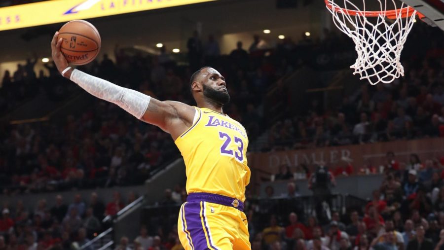
Los Angeles Lakers
Grade: B-
Unlike the other 15 earned jerseys, the Lakers uniform is the only one to have a gold Nike swoosh due to their championship run from last year’s playoff. Besides that, there’s not a whole lot about this jersey that is super special. It reps the typical Lakers logo with the purple and yellow colors, but it’s on a gray base. Not a lot of gray jerseys out there that really catch your eye and make you want to go buy one.
Orlando Magic
Grade: B
The Magic have had some loud and iconic uniforms since their foundation in 1989, so to be honest, this is one of their more reserved jerseys. However, down the sides of the jersey is a tribute to their blue-star pattern uniforms which graced the court from 1998-2003. Along with their iconic logo as the centerpiece on a white base, this is a pretty good-looking jersey with a subtle tribute to an old classic.
Portland Trailblazers
Grade: B+
At first glance, this jersey doesn’t look like anything special. But the more you look at it, the more you begin to appreciate its simplicity. All the Blazers did was take their association (white) uniform and turn it a few shades of gray. Nothing super special but sometimes, simplicity is best.
Utah Jazz
Grade: A-
This is by far one of the loudest jerseys of the 2020-21 earned collection, and it does not disappoint. It combines the current design of their statement note uniform and combines it with the 1979 green jersey. A perfect mix of both past and present. The only issue with this uniform is that it is almost identical to the earned jersey from 2018, which left fans seeking a little more creativity from the Nike design team. Also, is that Macklemore or Jordan Clarkson?
Denver Nuggets
Grade: A
The Nuggets have some of the best uniforms in the league, as every aspect of their jerseys reflects not only their team name, but also pays tribute to the geographical attributes of Colorado. This jersey goes right along with that theme as their oversized Nuggets basketball logo sits front and center on a white base, fully equipped with pick-axes. Along with their mountain shorts paying tribute to the Rockies, this is one of the most unique and best looking earned jerseys this year.
Milwaukee Bucks
Grade: A
To be honest, the Bucks have some of the most boring jerseys in the league. Their colors are super plain and don’t really draw much attention. However, the team took their “Fear The Deer” slogan and painted it on a jersey. With enlarged deer antlers up the sides and the Bucks name front and center, I am now genuinely terrified of Bambi — let alone the Greek Freak.
Boston Celtics
Grade: B+
The Celtics are among the most conservative NBA teams when it comes to jerseys. They rarely come out with something new and unique, usually sticking to minor variations on historic jersey concepts. While this year’s earned jersey is nothing groundbreaking, I think it’s one of their more adventurous options in recent years. The different shades of green complement each other well, and I like the lack of the usual overwhelming white featured on Celtics jerseys. The fact that it slightly departs from the norm is enough to make it stand out among the tame Boston classics.
Brooklyn Nets
Grade: A
The Nets have one of my favorite jersey lineups in the league, and this one only adds to the list of recent wins coming out of Brooklyn. Something about the simple white font on top of black zigzags makes this one feel like the hustle and bustle of the streets of New York. The court inside Barclays Center works effortlessly with these as well, making this a dominant jersey for a dominant team.
Toronto Raptors
Grade: B-
The Raptors dropping purple from their main color set is one of the biggest tragedies of the 21st century. Those classic Vince Carter teams with the iconic, basketball-spinning dinosaur on the jersey are synonymous with late 90’s and early 00’s hoops. This comes close to replicating the magic of vintage Raptors teams, but doesn’t quite fully commit to the choice. I love bringing back the purple to combine with the modern design of Toronto’s uniforms, but it still feels like it could have been so much more. The purple alone elevates this one to above average, and brings hope that The North might innovate with a new, yet familiar jersey again soon.
Miami Heat
Grade: D+
Well, these are certainly something. Upon first glance, it appears that Jimmy Butler and Bam Adebayo have been traded and are all of a sudden suiting up for the Indiana Pacers. That is not the case, as Miami has borrowed a color scheme from their conference rivals for their earned jersey this season. The jersey itself is fine, but this is not a color we are used to seeing in South Beach, and is more distracting than it is cool. If I was buying a Heat jersey, there are dozens of other past uniforms I would reach for long before touching this one.
Indiana Pacers
Grade: B+
This jersey evokes memories of the great Reggie Miller, and for that, it is noteworthy. Pinstripes and Pacers are a combination that always works, regardless of era. I can totally envision Miller knocking down three after three in these, and it works just as well for Domantas Sabonis posting someone up on the block. I can’t say these are perfect because they’re not completely new and innovative, but going back to the basics works in this case, maybe because we haven’t seen it much in recent years.
Dallas Mavericks
Grade: F
This is a similar case to the Pacers, but this one doesn’t do it for me nearly as well. For whatever reason, the Indiana jerseys feel like an homage to classic Pacers stars, but these Mavericks ones just feel lazy. Dallas has had the same jersey in a different font for the last fifteen years, and this jersey is not at all unique compared to other options in their current rotation. Yes, this one does remind me of Dirk Nowitzki and his dominant midrange game, but I wish the Mavericks would give us something with a little more spice. Their colors and mascot feel ripe for creating something we’ve never seen before, and this jersey is certainly not that.
Houston Rockets
Grade: A-
The Rockets are one of the worst teams in the NBA right now, but that doesn’t stop this jersey from checking all the right boxes. Houston has had similar concepts before, but these threads look so vibrant. They got the perfect shades for both colors here, mixing jet black with a vibrant, electric red. It’s not quite new enough to get a really high score from me, but this is how to take an existing jersey and make it substantially better.
LA Clippers
Grade: B-
I like this jersey for the Clippers. It’s simple, but not something we’ve seen before from LA. The powder gray with small accents of red and blue really bring this one together nicely. I enjoy the tiny bits of color trim on either side, and the Clippers logo in all gray. I think it pairs well with their court and looks good on their franchise player, Kawhi Leonard. It’s nothing special, but the fact that it’s unique compared to past jerseys and not too awkward lands this one in the middle of the pack.