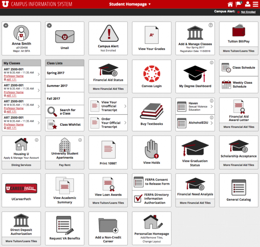
The University of Utah’s Campus Information System (CIS) is getting a modern twist. Still in the works, the new site is expected to go live late this summer or early fall of 2017.
Used by students and staff members, the web page contains links to financial aid information, grades, student records and more. The revamping of the page has been a work in progress for nearly five years, and its last design and update came in the early 2000s.
“We’ve been adding to the current design as people have new resources,” said Mark Curtz, U information technology project manager responsible for CIS 12. “It has probably been about the past four, five years that we have really been looking at redesigning it.”
While creating the new CIS, designers are working towards a site that is user-friendly, accessible on mobile devices, and one that has a more modern feel.
“We’re trying to address usability, trying to address mobile support, trying to get it into a more modern look and feel,” Curtz expressed.
Aiding in the fresh modern twist, the new website will feature iconized tiles instead of the lists of links that are present on the current version. “It’s cleaner,” said Kelsey Loizos, UX developer for U support services and U I.T. “It’s easier to look at. It matches more of the applications that students use today.”
The new site is intended to be user-friendly right off the bat with home screens that users can build themselves.
“They can personalize it to be what they want it to be,” Loizos said. “You can drag and drop. You can delete tiles, links [or] you can add them. You can make your own home page. You don’t have to use the one that’s already in there.”
U students and faculty were a focus point for the designers of the new CIS.
“The links that are used most often by our students will be at the top of the page where they can find them faster,” Loizos said. “We are using analytics and previous usability tests to determine what is used most in the portal in order to place the links on the correct spot on the page. The design is, in part, being driven by data.”
Those working on the system conducted usability tests in the Marriott Library on May 24 and 25 to let CIS users test out the new program and share their initial thoughts.
“We will be giving students a chance to use the system so we can gather feedback on the design and ultimately use that feedback to help inform the design of the portal,” Loizos said.
He encourages students, faculty and employees to stop by University Support Services to weigh in on the changes.
“It has been awhile since CIS was redesigned, and we want to make sure that the new design is usable for everyone,” Loizos said.
After years of the same flaws being reported, the web page aims to fix those issues and adopt more functions with blueprints drawn from its own users.
“We’re listening to students when we’re designing,” Loizos said. “I’m excited about that.”


