Whimsy Wall Art Project: A Love Letter to Utah
December 4, 2019
Newly developed structures and construction sites are nothing if not an everyday occurrence at this point for many of us. The new additions of freshly paved roads, parking garages and skyscrapers are all around, and each new project is seemingly no different from the last. One of the largest projects this state has seen to date seems to be setting itself apart from others, though — with the inclusion of pieces of artwork in the last place most people would expect to see them.
The Whimsy Wall Art Project
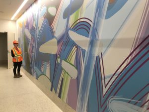
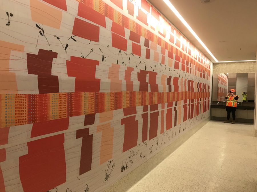
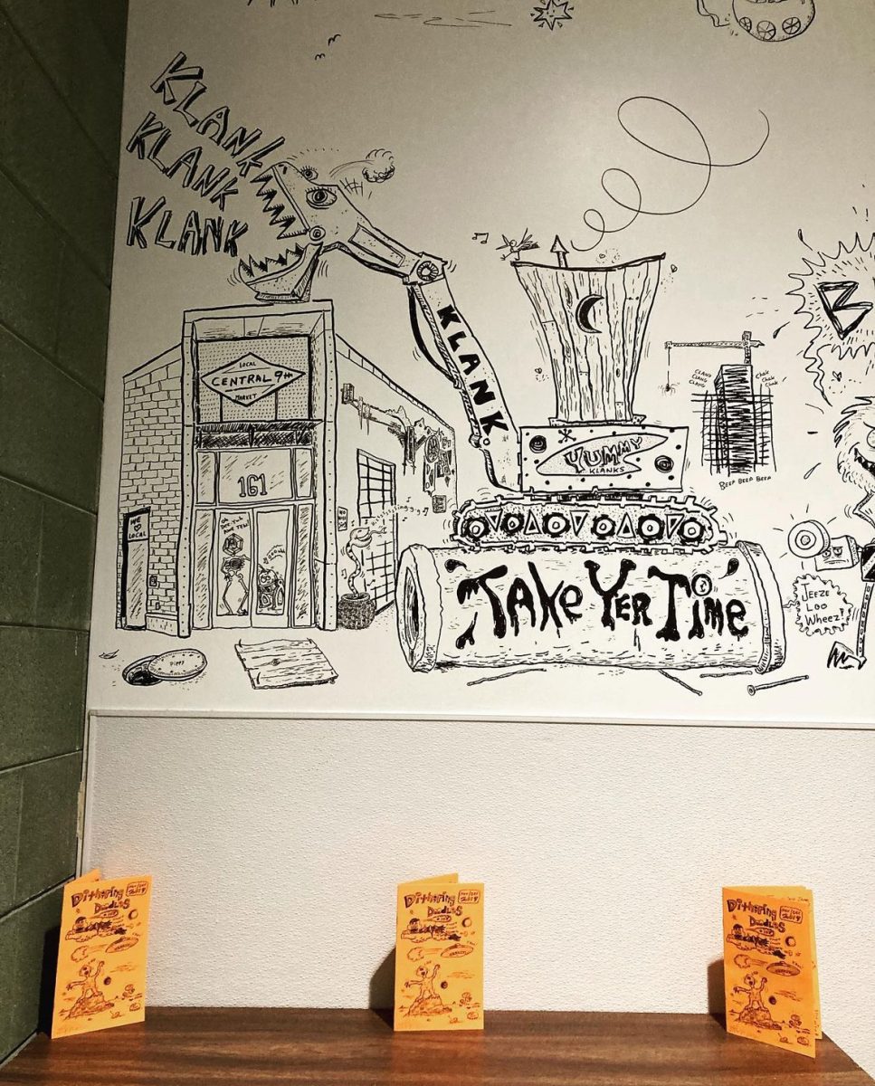
The new Salt Lake City airport has been years in the making, and the end result is looking to be a traveler’s dream come to fruition. We’re talking about less congestion, more restaurants and shopping areas and numerous charging stations for when you have a flight in an hour but your phone battery is draining. It seems the people behind the new airport design have thought of everything a traveler could potentially want or need. Though the upgrade seems to have met the desires of many travelers, there are aspects to the new facility that a traveler may never have thought to request, such as wall to wall murals placed in the bathrooms. The Whimsy Wall Art Project has done just that and has placed the work of 18 local and international artists on the walls of every restroom in the airport.
“Airports can be very stressful, especially in our post-9/11 world,” said Airport Director of Communication and Marketing Nancy Volmer. “We work to make sure our travelers have a pleasant experience when traveling.” People had specific requests and hopes when it was announced that the new airport was being built. The people behind the project listened to the community’s input and took suggestions to heart when conjuring up what an idealistic facility that would meet everyone’s needs would look like. They heard the desire for car rental availability, more places to charge electronics and less overall traffic. They also realized that people wanted a sense of Utah’s culture and spirit brought to the airport for travelers coming in and out of the space every day in order to distinguish this one from other airports. That pride in our state was a common theme reflected in so many people’s hopes for the new building that it inevitably inspired the design of the airport. The beauty that composes Utah has been directly incorporated into the plans and layout of the airport, right down to the inclusion of floor-to-ceiling murals in every restroom.
Art to Set Apart
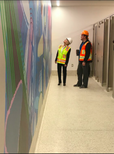
How many times have you been on a layover or had a connection and you can’t tell whether you’ve landed in Austin, Texas or Timbuktu? Every tunnel and baggage claim begins to look the same and eventually merge into one indistinguishable travel experience after another. Those instances of unfamiliarity are exactly what the new building hopes to stray from. With pieces depicting all the greatness that sets Utah apart, the airport will be distinguishable from others nationwide, especially with our hard-to-miss restrooms. The artwork in the new facility will not simply be an afterthought with paintings hung up after the building is up and open to the public. The art has been a part of the planning stages since the very beginning. The idea of having a hub that speaks to the culture of Utah embodies the state’s personality and speaks of the individuals who reside here has been a goal from the start of the planning stages.
“The unique part of our artwork is the forethought that the art be incorporated into the architecture,” Volmer said. “Artwork can be calming and serve as a distraction in an airport. I think there are a lot of reasons to have artwork in the airport. The open call was made for local and international artists to provide submissions to potentially be a part of the Whimsy project was made earlier this year.
Trent Call was one of the eight local artists whose piece was chosen for the project and the experience differed from his previous work.“It’s rare that people call for bathroom art,” Call said, of first hearing about the unique opportunity. “It’s the first time I’ve done something like this. Overall it was a good experience. I’m definitely glad they picked me.”
Some of the artwork selected includes shots of the desert, a field of wildflowers, a sun setting over the Great Salt Lake and Call’s abstract depiction of Lake Bonneville. Utah is such a beautiful state inside and out, and to be able to bring that beauty and display it in a non-traditional way seems to be the driving force in this project. These statement pieces in the bathrooms are going to have people come face to face with all the things that make our state great, in the place they’d least expect to. The airport is going to be a love letter to Utah through and through — from the restrooms to the terminals — and the Whimsy Walls are just the beginning. While the first stage of the new airport won’t be open until September 2020, it’s evident the result will be worth the wait on this one.


